When looking around a workplace, either as residents or visitors, we tend to draw conclusions about the organisation using the space: Who are these people? What is important to them? How do they improve people’s lives? Do I belong here? Do this company’s products or services fit neatly into my world, making it a better place?
But are these impressions correct?
Many workplaces send mixed messages about the company and the brand. This is because some leaders are unclear about the image they want to portray through their work environment, while others don’t know how to translate their brand into interior features such as room layouts, furniture and decor.
Companies often use their corporate colours as feature colours of their workplaces, and this is where the efforts stop. Furniture and wall colours tell little about the essence of the organisation, and can even have negative psychological effects. (For example, a red logo or a green font type have completely different meanings and trigger different emotions than a red carpet or a green wall.) Those businesses who decorate their walls with marketing imagery, in the name of creating brand presence, also miss the point.
To build strong relationships with anyone coming in the door, you need to present your brand clearly and consistently across all communication platforms, including the work environment. The space needs to demonstrate your company’s values, beliefs and personality. This will make it easier for your clients to get to know and trust you, and for your team members to commit to your vision and fit into your culture. Imagine dealing with people who just know they are in the right place as soon as they come through the door, whether for the first time or for the thousandth time.
How to do this right? Sometimes we can learn a lot about workplace design from the most improbable places, in this case, from a hospital. Melbourne’s Royal Children’s Hospital is an excellent example of how the physical space can embody the essence of the organisation, send powerful messages, and provide memorable experiences to people.
The Royal Children’s Hospital
The new hospital opened in 2011 to replace its almost 50-year-old predecessor, a typical, institutional-looking hospital which belonged to a past era. The new building, designed by Billard Leece Partnership and Bates Smart Architects, provides a radically different, positive and engaging hospital experience to children.
Here you won’t need to walk through plain corridors, sit in sterile-looking waiting rooms, stare at pale green walls, or smell the odours of chemicals. The building doesn’t look or feel like a ‘hospital’. It doesn’t communicate sickness – it’s all about life.
The designers took into account how an injured or sick child might feel, and expressed empowering messages through forms and textures, lights and sounds, furniture, artwork, internal layout, and signage for navigation. The building speaks children’s language, making them feel relaxed, happy and safe, while also engaging everyone else involved in the care of a sick child, both families and staff.
‘We are in nature’
Children are fascinated by nature, and this inspired the designers to create an environment in which nature is present everywhere you look. The building is airy and filled with natural light. There are views to a nearby park or to internal landscaped courtyards from most spaces in the building, from circulation areas and sitting bays to patient rooms and operating theatres.
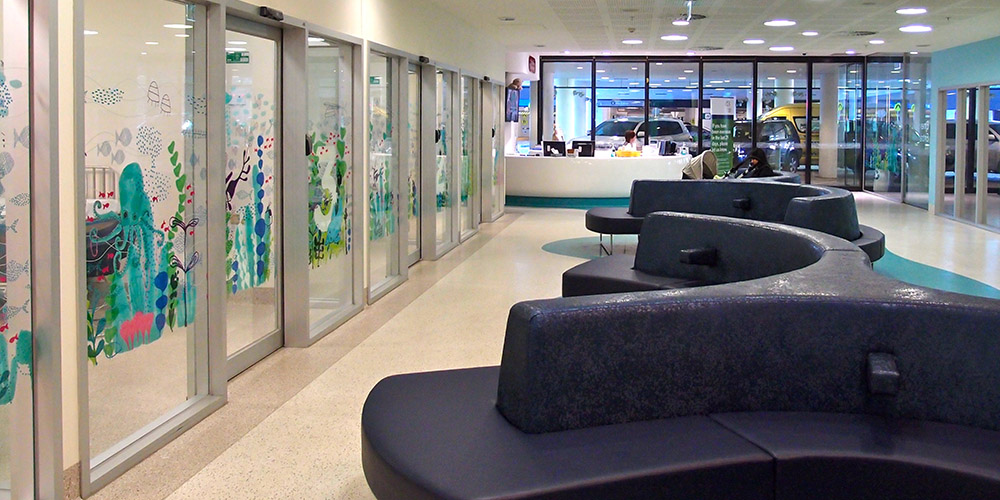
Graphics, illustrating animals and landscapes of Victoria, are placed on almost every conceivable wall surface. Each floor has a theme. When you arrive at the basement car park, you see drawings of friendly earthworms, and as you’re moving up, you encounter sea life, forest life, mountain life, and birds in the sky. The names of inpatient units also follow these themes; for example, Dolphin Ward is ‘Underwater’ (Lower Ground), while Koala Ward is in ‘Tree Tops’ (Level 3).
‘Let’s have fun’
This hospital is a fun place to be; it offers plenty of opportunities for discovery, and for engaging, magical experiences for children. (And also for grown-ups. When visiting the hospital, I could feel my inner child waking up.)
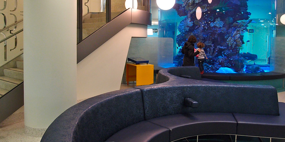
In front of the entry you can’t miss the two-storey cylindrical fish tank. This makes taking the stairs to the emergency department a real adventure, giving you the opportunity to see the fish tank in its full height. The hospital is also famous for its meerkat enclosure.
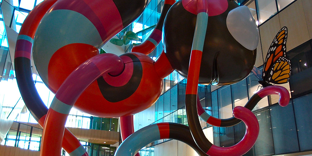
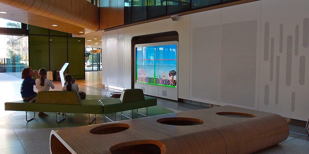
The foyer has several large scale artworks, including a multi-coloured sculpture called ‘Creature’, and a series of floating leaf-like canopies called ‘Sky Garden’. The information counter is also an impressive piece of art. (My interpretation would be a UFO.) The seats don’t look like seats either; they have interesting shapes and textures, reminding you more of boulders, creatures and elements of a landscape.
In the context of hospital design for children, science calls these features ‘distractions’. However, their role is more than what this term suggests; they invite children to focus on what they enjoy, instead of leaving them alone with their health condition in an unstimulating environment. If the building could speak, it would say something like: ‘Let’s have fun, healing doesn’t need to be scary. We are here to help you enjoy life.’
‘This is a safe place’
These striking features also assist with easy navigation through this enormous building, which is crucial for making children – and adults – feel relaxed and safe. In addition, the signage uses simple words that children understand. (For example, instead of the intimidating medical term ‘Ophthalmology’, the sign says ‘Eye care’.)
Several other features contribute to making this hospital feel safe. There are no off-putting service roads around the building; the surrounding landscaped garden and the intriguing design of the main facade make entering the hospital a pleasant experience. Although the building is vast, it is broken down to human scale, so it’s not at all dominating. And there are soft edges all around; walls, furniture and ceiling edges are all rounded.
‘Our purpose is healing’
The Royal Children’s Hospital is a healthcare facility that actually looks and feels healthy. And by advocating for health in the right way, it achieves way more than just providing a pleasant experience. Directing children’s focus to the external world and away from their sickness, helping them connect with nature, making them feel safe and engaged – these are all design strategies that actually improve health outcomes in hospitals, as shown by science. Design can heal people, and even save lives!


